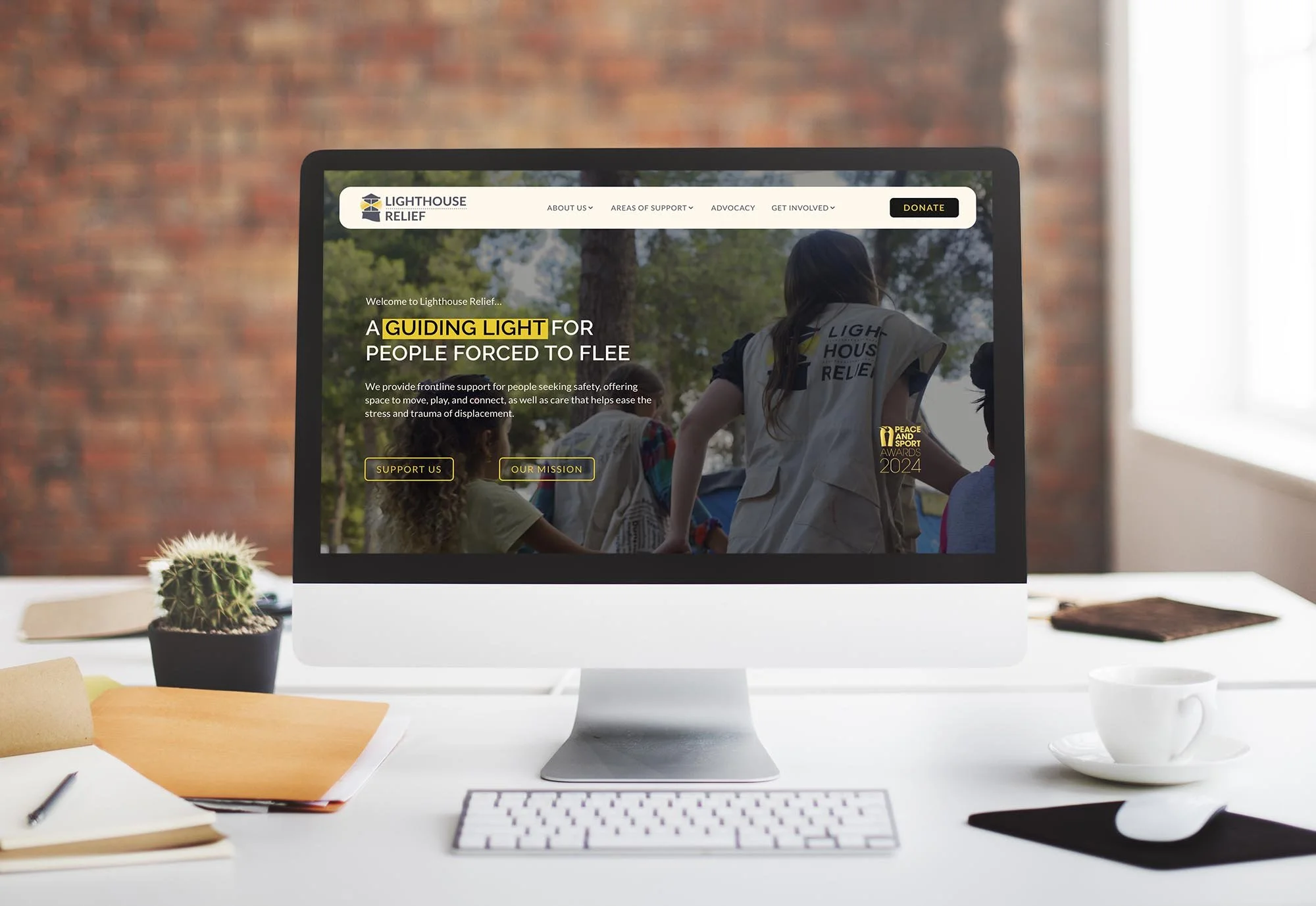
Lighthouse Relief Website Project
Sector: Humanitarian Charity
Services: Homepage Redesign • Donation Page Optimisation • UX & Navigation Improvements
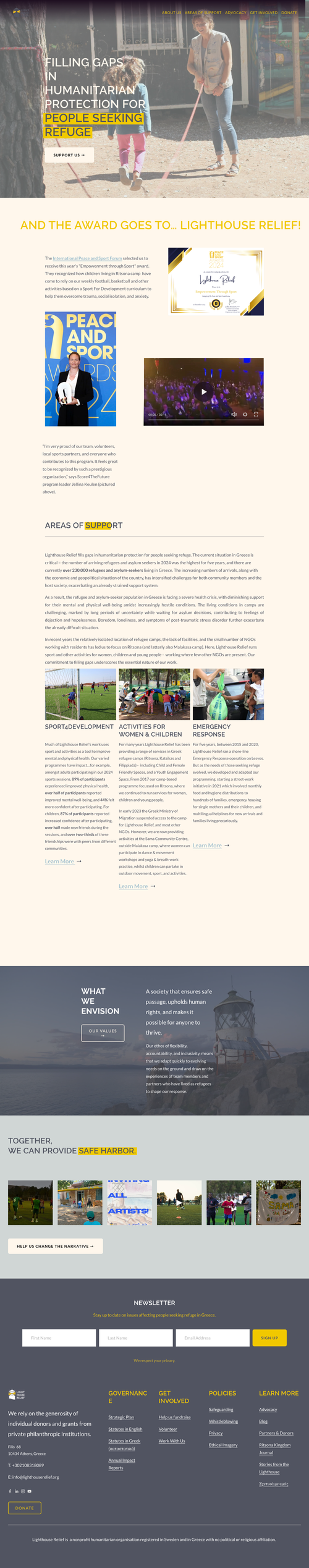
About Lighthouse Relief
For families living in refugee camps north of Athens, daily life is filled with uncertainty and isolation. Lighthouse Relief creates safe, welcoming spaces where women, children, and young people can play, laugh, and feel a sense of normality.
Through sport, games, and creative activities, they help ease the psychological toll of displacement, build confidence, and create bonds between diverse communities. Their work is vital — and they needed a website that reflected their mission and inspired visitors to support it.
The Challenge
When Lighthouse Relief approached me, they were struggling with a few key issues on their website:
Visitors were landing on the site but not completing donations
High bounce rates meant people weren’t staying long enough to learn about their work
Calls-to-action (CTAs) like “Donate” and “Get Involved” weren’t getting clicks
The navigation was confusing, making it hard for users to find the information they needed
As someone who specialises in Charity Web Design, I knew that we needed to create a website that not only looked better but also guided supporters smoothly toward taking action.
Before
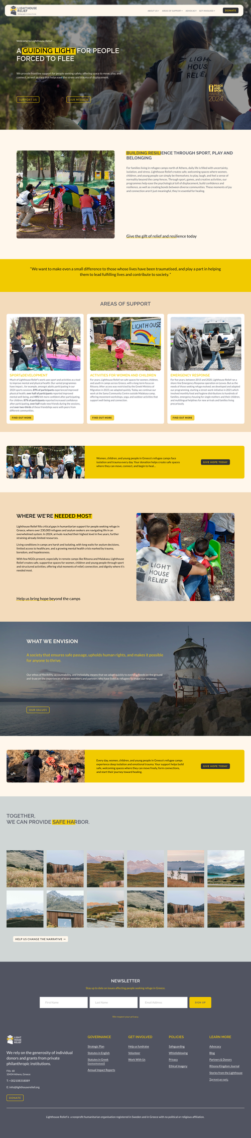
After
My Approach
My main goal was to inspire visitors, increase donations, and make it easier for people to engage with Lighthouse Relief’s work.
Here’s what I focused on:
1. A Fresh Homepage Redesign
I redesigned the homepage to make it cleaner, more modern, and mission-focused. By improving the visual layout and highlighting Lighthouse Relief’s impact, visitors are now drawn in straight away.
2. Donation Page Optimisation
I streamlined the donation process to make it faster and simpler, especially for mobile users. Suggested donation amounts, stronger CTAs, and a more intuitive layout make giving easier and more compelling.
3. Clearer Navigation & Better UX
The old site made it tricky for users to find what they were looking for. I restructured the navigation to make it simple and logical, helping visitors reach important pages—like “Donate,” “Get Involved,” and “Programmes”—with fewer clicks.

4. Stronger Calls-to-Action
I redesigned the CTAs across the site to make them more visible and persuasive. Every button and link now guides visitors towards meaningful next steps.
The Results
While it’s still early days, the updates are already helping Lighthouse Relief to:
Increase donations by removing barriers to giving
Reduce bounce rates with a more engaging, user-friendly homepage
Improve CTA engagement with clearer, more compelling design
Build trust with a modern, professional look that reflects their mission
This project is a great example of how strategic charity website design and non-profit web design can make a real difference to a charity’s online presence and fundraising success.
Final Thoughts
I loved working with Lighthouse Relief on this project. Their mission is so inspiring, and I wanted to make sure their website reflected that passion while also making it easy for supporters to donate and get involved.
If your charity is struggling with low donations, high bounce rates, or poor engagement, I can help you redesign your site to deliver better results.
Website Platform
This website was built using Squarespace .
Squarespace offers great value for money for charities and nonprofits with add ons such as donations, email marketing and e-commerce functionality.
💡 Looking for a sustainable website that reflects your values?
Let’s create a beautiful, efficient, and eco-conscious digital space for your business. Get in touch with me for a chat
More from my portfolio…