How to Add a Simple Squarespace Vertical Timeline
Last updated: 18/03/2026
Easy Guide To Adding a Timeline For Squarespace.
TL;DR
You can add a vertical timeline to Squarespace using simple CSS and layout blocks
Timelines are great for storytelling, case studies, and charity impact pages
This method works without plugins or complex coding
You can fully customise colours, spacing, and layout to match your brand
A timeline helps make content more engaging and easier to follow
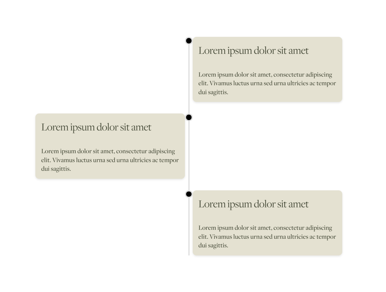
Here’s my guide on how to create a Squarespace Vertical Timeline
Timelines are one of the best ways to showcase key events, milestones, or even your brand's journey in a clean, visual, and engaging format. For Squarespace websites, adding an animated vertical timeline is a fantastic way to elevate the storytelling aspect of your site. Whether you’re building a timeline for a nonprofit’s accomplishments, a business journey, or an event schedule, it’s an attractive feature that captivates visitors.
In this tutorial, I’ll walk you through how to easily create a Squarespace vertical timeline using custom HTML and CSS. The best part? It’s fully responsive, beautifully animated, and works seamlessly as a basic Squarespace timeline template.
If you’re looking for something with a little extra zazz you can upgrade to my premium animated timeline plugin for even more great features like a ‘read more’ dropdown button, date snippets and animation.

Premium Timeline Plugin Option
Step 1: Add the HTML Code
To get started, log into your Squarespace site and navigate to the page where you'd like the timeline to appear. Add a Code Block to the page and insert the following HTML. I have highlighted the areas below which you need to update to your own title and descriptions. Simply copy each code section part between the <li class =’timeline-item'“> and </li> to add more items to your timeline.
<div class="main-timeline">
<h1 class="center">Responsive Vertical Timeline</h1>
<ul class="timeline">
<li class="timeline-item">
<div class="timeline-content">
<h3>Lorem ipsum dolor sit amet</h3>
<p>Lorem ipsum dolor sit amet, consectetur adipiscing elit. Vivamus luctus urna sed urna ultricies ac tempor dui sagittis.</p>
</div>
</li>
<li class="timeline-item">
<div class="timeline-content">
<h3>Lorem ipsum dolor sit amet</h3>
<p>Lorem ipsum dolor sit amet, consectetur adipiscing elit. Vivamus luctus urna sed urna ultricies ac tempor dui sagittis.</p>
</div>
</li>
<li class="timeline-item">
<div class="timeline-content">
<h3>Lorem ipsum dolor sit amet</h3>
<p>Lorem ipsum dolor sit amet, consectetur adipiscing elit. Vivamus luctus urna sed urna ultricies ac tempor dui sagittis.</p>
</div>
</li>
</ul>
</div>
Step 2
Add the CSS code to style your Squarespace vertical timeline
Add the below code to your custom css. Go to > pages > website tools > Custom CSS and paste the code. Feel free to change the sizing and colors to suit your needs. See code highlighted in bold below for typical styles you may want to change to suit your brand.
/* ==================================================
SQUARE GENIUS TIMELINE
================================================== */
/* Main timeline container */
.main-timeline {
max-width: 800px; /* CUSTOMISE: Maximum width of the entire timeline */
margin: 0 auto; /* Centres the timeline on the page */
position: relative;
padding: 20px; /* CUSTOMISE: Space around the timeline */
}
/* Timeline list */
.timeline {
list-style: none; /* Removes default list bullets */
padding: 0;
position: relative;
}
/* Individual timeline item */
.timeline-item {
display: flex;
justify-content: flex-start;
margin-bottom: 30px; /* CUSTOMISE: Space between timeline items */
position: relative;
}
/* Moves alternating timeline items to the right */
.timeline-item:nth-child(odd) {
justify-content: flex-end;
}
/* Timeline content card */
.timeline-content {
max-width: 45%; /* CUSTOMISE: Width of each timeline card */
background: #E5E1D0; /* CUSTOMISE: Card background colour */
padding: 15px; /* CUSTOMISE: Space inside each card */
border-radius: 10px; /* CUSTOMISE: Rounded card corners */
box-shadow: 0 2px 5px rgba(0, 0, 0, 0.1);
/* CUSTOMISE: Card shadow
First value = horizontal position
Second value = vertical position
Third value = blur
Final value = shadow colour and opacity
*/
position: relative;
}
/* Timeline pin/dot */
.timeline-content::before {
content: "";
position: absolute;
top: 0; /* CUSTOMISE: Vertical position of the pin */
right: -20px; /* CUSTOMISE: Distance between card and pin */
width: 14px; /* CUSTOMISE: Pin width */
height: 14px; /* CUSTOMISE: Pin height */
background-color: #000; /* CUSTOMISE: Pin colour */
border-radius: 50%; /* Makes the pin circular */
border: 3px solid #ddd; /* CUSTOMISE: Pin border thickness and colour */
z-index: 1;
}
/* Moves pins to the opposite side on alternating cards */
.timeline-item:nth-child(odd) .timeline-content::before {
right: auto;
left: -20px; /* CUSTOMISE: Distance between card and pin */
}
/* Timeline heading */
text-align: center;
margin-bottom: 30px; /* CUSTOMISE: Space below the heading */
}
/* Central vertical timeline line */
.timeline::before {
content: "";
position: absolute;
top: 0;
bottom: 0;
left: 50%; /* Positions the line in the centre */
width: 3px; /* CUSTOMISE: Timeline line thickness */
background: #ddd; /* CUSTOMISE: Timeline line colour */
transform: translateX(-50%);
}
/* ==================================================
RESPONSIVE DESIGN FOR MOBILE
================================================== */
@media screen and (max-width: 768px) {
/* CUSTOMISE: Change 768px to adjust when the mobile layout begins */
/* Stacks timeline items vertically */
.timeline-item {
flex-direction: column;
justify-content: flex-start;
align-items: flex-start;
}
/* Stops alternating cards on mobile */
.timeline-item:nth-child(odd) {
justify-content: flex-start;
}
/* Makes timeline cards full width */
.timeline-content {
max-width: 100%;
margin-left: 20px;
/* CUSTOMISE: Space between the mobile timeline line and cards */
}
/* Positions pins over the mobile timeline line */
.timeline-content::before {
left: -6%;
/* CUSTOMISE: Horizontal pin position on mobile */
right: auto;
transform: translateX(-50%);
}
/* Moves the timeline line to the left on mobile */
.timeline::before {
left: -1px;
/* CUSTOMISE: Horizontal position of the mobile timeline line */
transform: none;
}
}
Step 3: Preview and Publish
Save your changes and preview your site. You should now see a fully functional Squarespace vertical timeline with an alternating layout. On mobile, the timeline will automatically stack for a smooth responsive experience.
Add a Dynamic Timeline to Your Squarespace Website Today!
With this guide, adding a timeline Squarespace feature has never been easier. By incorporating a responsive animated vertical timeline, you can enhance your site’s storytelling and create a visually striking experience for your visitors. Whether you’re a business owner, nonprofit, or creative professional, timelines are a versatile and engaging design element that will set your Squarespace site apart.
For more cool Squarespace tips check out my blog, or sign up to my newsletter.
Did I help you? Consider buying me a coffee as thanks!
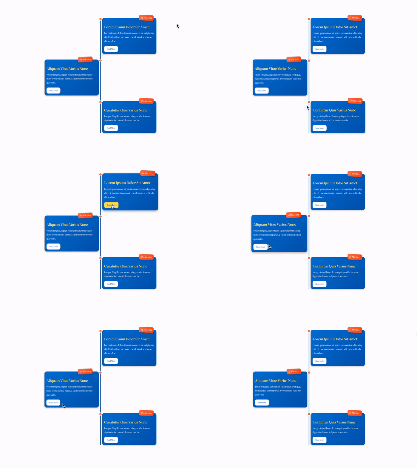
Transform your Squarespace site with this dynamic Squarespace timeline plugin, perfect for showcasing history, milestones, services, or storytelling in style. Designed to be bold, colorful, and fully customizable, this Squarespace timeline template brings your content to life with smooth animations and a professional design. Whether you're displaying a company's journey, project phases, or even personal achievements, this vertical timeline Squarespace plugin is the perfect way to engage your audience.
Packed with features like responsive design, hover effects, and interactive "read more" buttons, this timeline Squarespace tool is easy to install and edit—no coding experience required! Create an eye-catching, functional timeline in minutes that fits seamlessly into your site design.
Squarespace Timeline Plugin Compatibility
Compatible with Squarespace 7.1 only, this plugin is easy to install and fully customizable. You can change the colours, font sizes and more!
Check out my Squarespace Premium Plugins
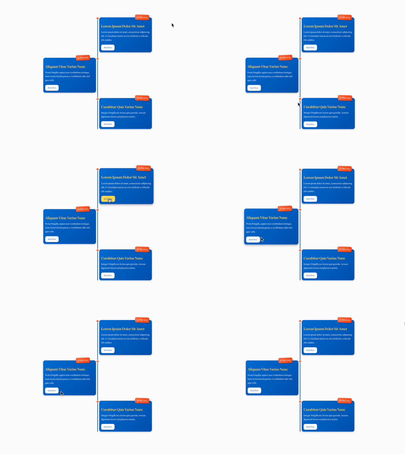
Premium Timeline Plugin
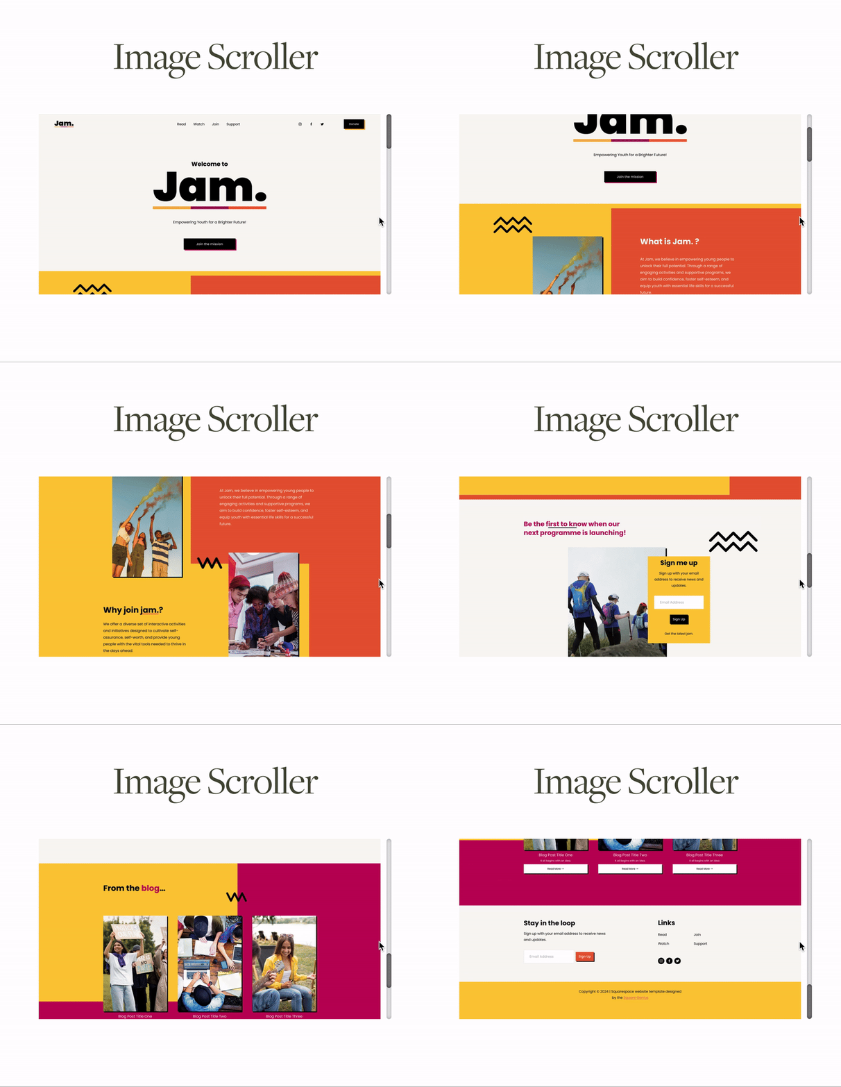
Image Scroller Plugin